Claymorphism Generator
Hello
Claymorphism
SUP!
Looks Nice?
Claymorphic Generator
37%
69%
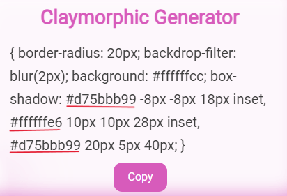
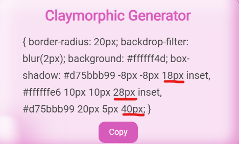
.claymorphShadow { border-radius: 20px; backdrop-filter: blur(2px); background: #ffffff0.3; box-shadow: #d75bbb99 -8px -8px 18px inset, #ffffffe6 10px 10px 28px inset, #d75bbb99 20px 5px 40px; }
Table of Contents
Claymorphirm Trends
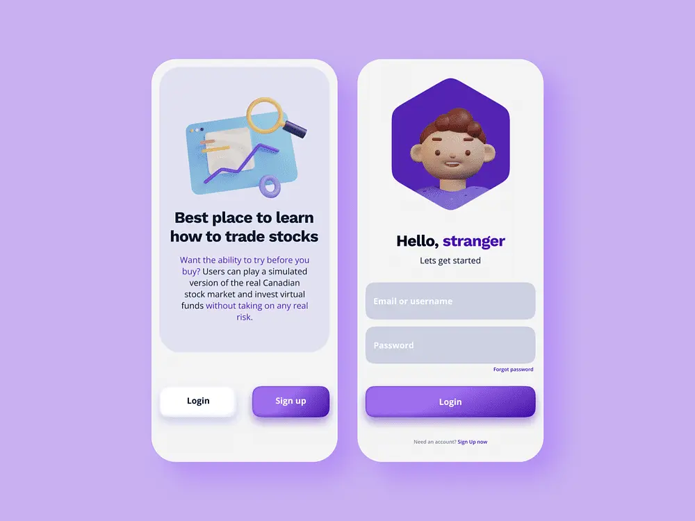
The Claymorphism UI refers to the 3d style inflated elements with a background shadow. It is getting popular in creative designs to enhance the “plasticity” of web design in 2024. Horizon Worlds is the most popular game which has incorporated claymorphism in their assets. It would be suited for sites targeting playfulness, childishness, casual vibes, and something different than the Flat design. Designers are getting bored of Flat designs so they’re looking something new to let out their creativity. Some of the Claymorphic UI designs are shown below.


Claymorphism UI Guidelines
You can be as creative as you want with your UI UX designs. But in case, you’re looking for some standard guidelines or good practices for Claymorphism, we’ve listed some below.
Intensity
The intensity controls the bottom shadow size of the UI element. The larger the shadow size the larger the claymorphic or 3d inflated effect. We do not recommend any intensity range. The intensity will differ based on your UI element size and the subtleness you want.
Large intensity can bleed into the contents of the UI element, so you have to be careful about that.
The color of the shadow can be changed from the advanced tab > Shadow Color option.
Transparency
The transparency value controls the transparency of the UI element. I don’t recommend any particular value for transparency. It depends on your use case. As the transparency increases the background color of the element becomes visible.
The transparency level of the shadow colors can be edited from the generated css. The first color controls the bottom shadow, second color controls the top shadow, and third color controls the background shadow color.
Top Shadow and Background Shadow
The top shadow value controls the strength of top shadow of the main UI element. The default size of top shadow is 10 pixels and color is white with transparency of 0.9.
The background shadow value controls the strength of background shadow of the main UI element. The default size of bottom shadow is 18 pixels from top. The color of background shadow is our brand neural color with transparency of 0.6.
The top and background shadow color can be changed to the brand neutrals or slight contrast to the background color. To change the background and top shadow color go to Advance Shadow Control.
Shadow Direction
The shadow direction allows you to change the shadow direction in three ways – top to bottom, top to bottom right, and top to bottom left. If you want to change the direction from bottom to top then change the direction from the generated css.
Shadow Blur
The default shadow blur in my Claymorphism css generator is 18px for the bottom, 40px for the background and 28px for the top shadow. I found that size to be appropriate. If you want smoother and more coherent shadows then increase the shadow blur value in the generated css.
Background Blur
The background blur value controls the background blur behind the main UI element. Try experimenting with different values of transparency. If transparency value if set to 1. Then background blur will have no visible effect.
If you want to see the effects of background blur then transparency range should be lower than 0.7.
Try these generators as well

Glassmorphism Audio App UI
Glassmorphism Generator

Neomorphism Freelance Profile UI
Neumorphism Generator