Glassmorphism Generator
Hello
Glassmorphism
SUP!
Looks Nice?
Glassmorphism Generator
37%
69%
.claymorphShadow { border-radius: 20px; backdrop-filter: blur(2px); background: #ffffff0.3; box-shadow: #d75bbb99 -8px -8px 18px inset, #ffffffe6 10px 10px 28px inset, #d75bbb99 20px 5px 40px; }
Table of Contents
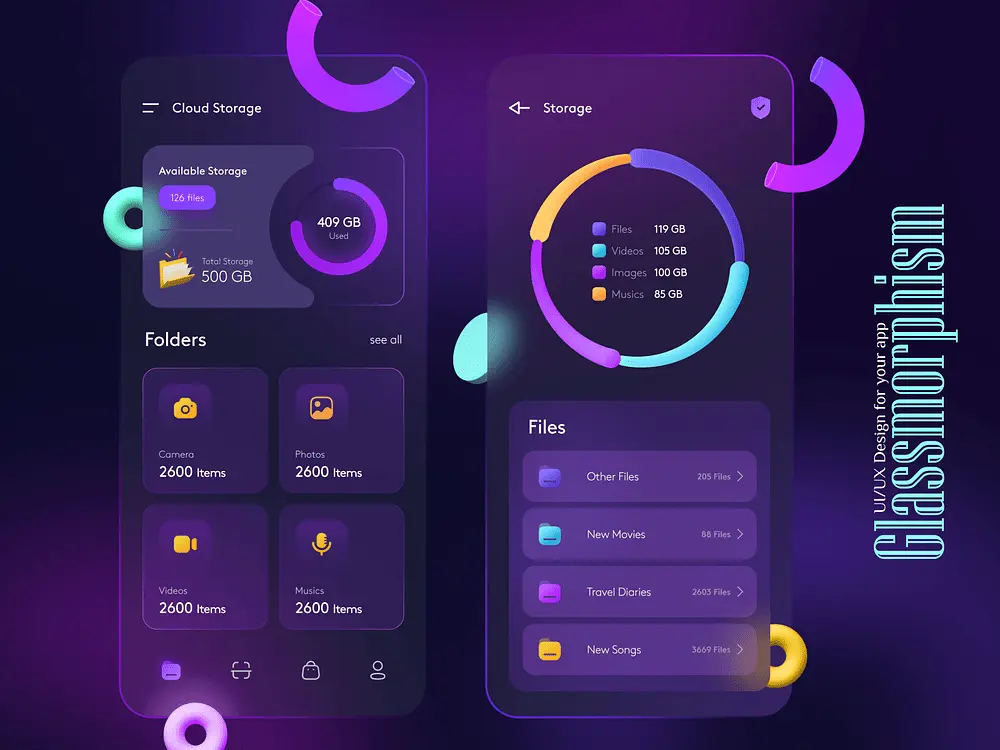
Glassmorphirm Trends
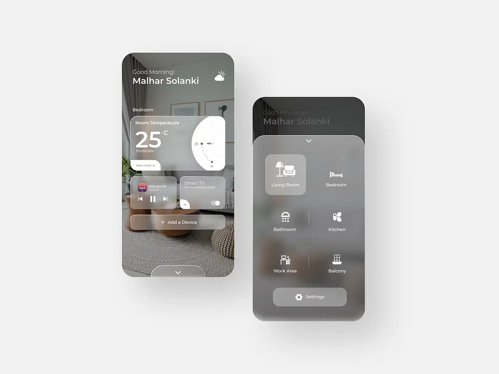
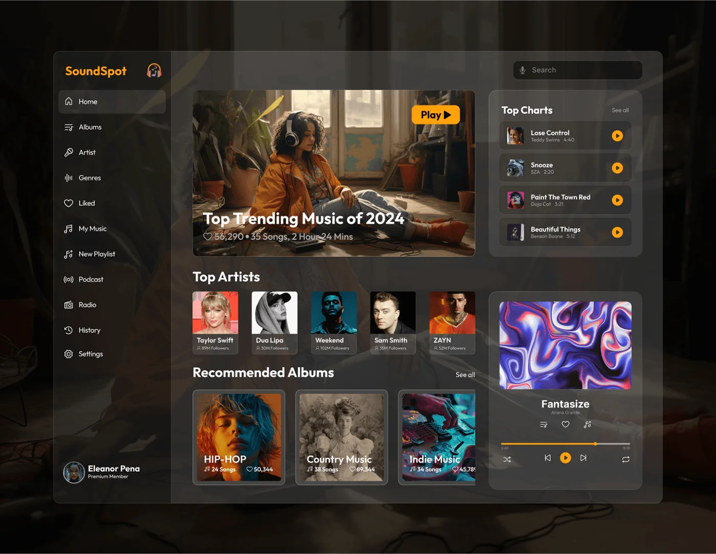
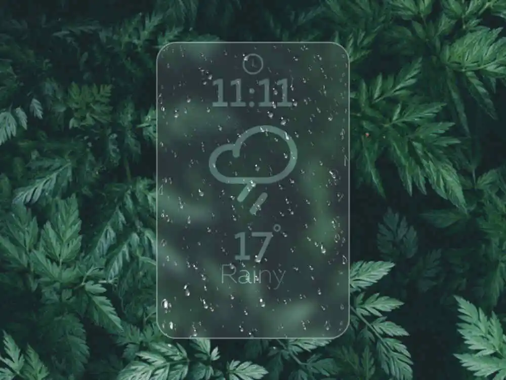
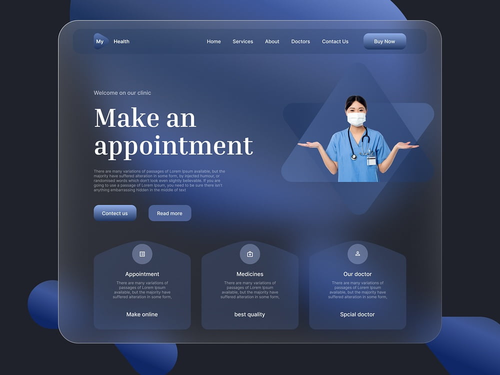
The Glassmorphic style UI UX is getting popular in 2024. This UI trend is widely used in VR and AR industry. Apple and Microsoft are the most popular companies that have used glassmorphism in their UI. Even I have also used it on my website’s homepage. It creates a sense of depth and “frosted glass” effect. Some of the Glassmorphic UI designs are shown below.
Glassmorphism UI Guidelines
You can be as creative as you want with UI UX designs and embed glassmorphism. In case, you’re looking for standard guidelines or good practices, we’ve listed some below.
Background and Transparency
The transparency of your element should be low. So that the background elements can be seen. if transparency is set to 1, then only the background of the element will be visible.
Our recommended range for glassmorphism Transparency is 0.3 – 0.6. If the background is busy or reducing the visibility of foreground elements then increase the transparency. Experiment with gradients or pictures as background because they look much better with glassmorphism effect rather than solid colors.
Our Glassmorphism css generator has the default background as white. Try changing the element’s background color to brand neutrals or background hue with lighter or darker luminosity. This will help in creating the “frosted glass” effect. Also experiment with the subtle gradients to enhance the glassmorphic effect.
Intensity
The intensity determines the background blur property. The background blur value is in pixels.
Our recommended range for glassmorphism background blur is 3 – 12 pixels.
If you want the background elements to be peeking through your hero element then try lower values between 1 to 4. And similarly, for extreme blurring you can go over 10 pixels as well.
Contrast & Accessibiltiy
There should be enough contrast between your hero element, the text, and background elements. Low contrast is not good for accessibility. To maintain enough contrast you can try using different colors schemes that may be complimentary. We recommend using the hsl color values. Manipulating the saturation and luminance to maintain contrast will result in an analogous color scheme. Ideally the text color should be neutrals like black, white, or grey. If you already have a color pallet then try using that first.
Depth
The glassmorphism effect relies on making layers. The main element can be your foreground. And the background can be other elements, images, gradients, or just solid colors. You can also add other elements as the mid ground between foreground and background. These front, middle and back layers creates depth in the glassmorphism effect.
Saturation
The Saturation value saturates or desaturates the background behind the element. The 100% is default. The values lesser than 100% will desaturate the background and more than 100% will saturate the background behind the element.
The saturation can be left at default of 100%. You can experiment and play with saturation to find your creative style.
Shadow
Shadow can enhance the Glassmorphism effects but shadow should not overpower the glassmorphism effect.
The recommended range for shadow size is 0 – 2 pixel. The shadow color can be lighter or darker than your neutral colors. The Default shadow color in my Glassmorphism css generator is white.
For custom shadows, try my Shadow generators listed below.
Border
There is no recommended border size. The modern UIs usually have borders less than 3 pixel. The border color can be lighter or darker shade of the background element or the brand neutrals.
Try these generators as well
Claymorphism Food UI
Claymorphism Generator
Neomorphism UI
Neumorphism Generator